Hi all,
As my initiative to give back to all my supporters and friends I will be posting a series of steps into my painting process that I did awhile back for Imagine FX. So for those who missed it or would like to share it with your friends , please feel free to d0 so by clicking the share buttons below each post.
So I will begin with an Intro and the first 4 steps, and each day I will post another 4 so check daily for updates.
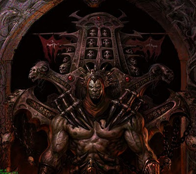
Tutorial: Dark Fantasy Digital Painting by: J.P. Targete
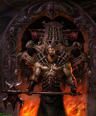
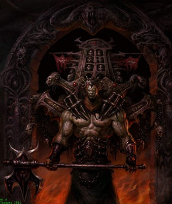
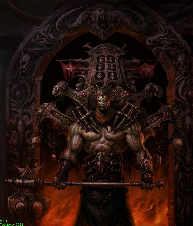
Some fantasy art is not all about cute elves and pet dragons, sit back as I take you through the steps I take to creating a dark fantasy painting from roughs to the final painting titled "The Purifier" .
J.P. Targete
Whats the diffrence between Dark fantasy and regular ole Fantasy? you ask. Well it's not the obvious, which is, it doesn't actually have to be a literally dark image or have a muted color palette. However it does
have to have a sense of of mystery, obscurity or a threatening mood of pending or present fear visualized in the image. Also what makes "Dark Fantasy art" distinct is that it introduces
an element of reality to the viewers visual experience which is diffrent then the typical "Fantasy" it can appeal to them or make them feel uneasy, etc. Lets face it many of us like to be scared or surprised and "Dark fantasy" can do this.
So when I was asked to do a workshop on anything, I choose to do my favorite genre "Dark Fantasy". I find it most interesting and enjoyable to play with and keeps me engrossed from start to finish.
I enjoy simplicity in concept and idea, however I love all the small technical details and processes needed to give life to those simple ideas. In this tutorial I will start with a simple idea in thumbnail form and develop it into
a drawing that we will develop into a fully detailed colored illustration using photoshop CS2. There is more then one way to skin a cat, in our case more then one technique and tool in photoshop to get the results we want. I will go over the
techniques and tools I use. I'll also discuss the ideas and concepts behind the character "The Purifier". I'll go over painting, color, lighting, surface materials and detailing. This tutorial is for
artist who have a basic to good understanding of photoshop.
STEP 1.
BIRTH OF AN IDEA
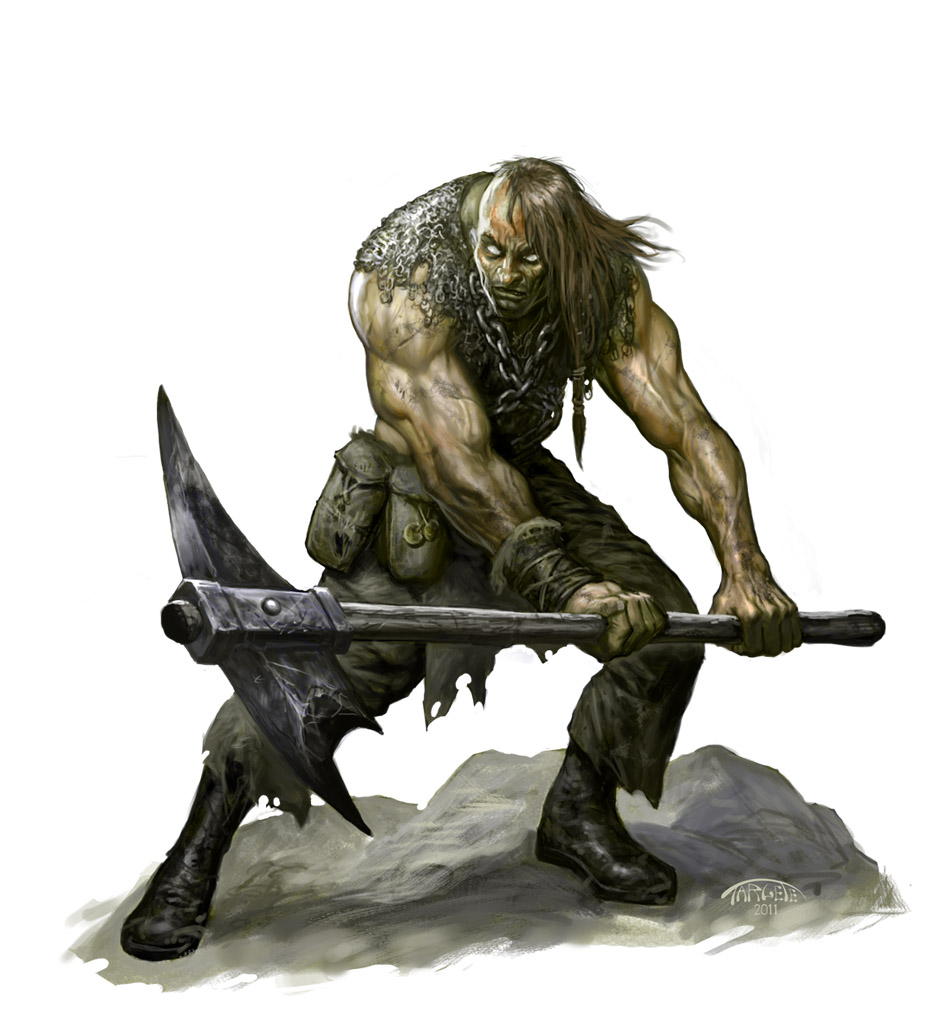
For this first step I use pencil and paper and start sketching to fuel my ideas. When I first started sketching I didn't have a clear idea of what I wanted to do.
I just knew that I wanted to do a powerful character either in battle or just standing in a "I'll kick your ass" pose. As I continued to sketch I found myself straying away from the more
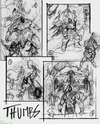
action oriented thumbs because I've done many battle type paintings in the past. I chose to do the more iconic posed character in sketch # 4, the character holding the axe.
This would allow me to focus on the single character, details and background decor.
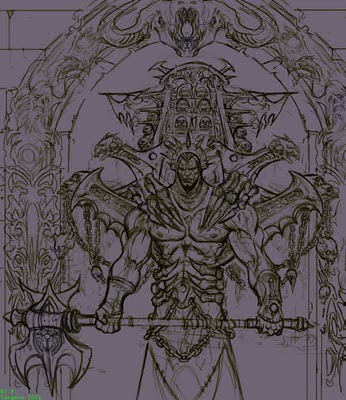
STEP 2
DEVELOP A LINE DRAWING
In this step I took my raw thumbnail and developed it into a line drawing, I then scanned it at about 10"x13" at 200 dpi and tweaked it in photoshop . It's important to keep the drawing mostly bold line work, I'll tell you why later.Try to get as much detail and refinment in the shapes, anatomy etc in this pass because it will save you alot of grief later on. As I am
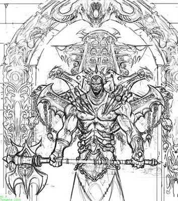
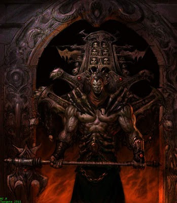
drawing it I am designing and actually free forming and embelishing my initail idea. I came up with this; the character in this image is called "The Purifier" he is a cursed lord from the underworld who travels between our world and his. He purifies the lost souls of humans and creatures of both worlds who are dammed and hopeless. He basically purifies their bodies through pain and eventually death allowing their souls to be set free and collected. The object on his back is actually a dark magic soul collecting mechanism which is attached to him always.
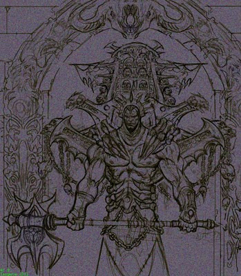
STEP 3
COLORIZE YOUR LINE ART
The next step is to colorize your BW line art. The reason to do this is because at some point you will merge your line art with your painting and the colored line can be easier to deal with then
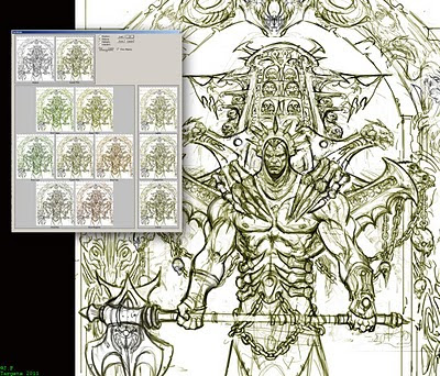
the BW line as far as painting over it.
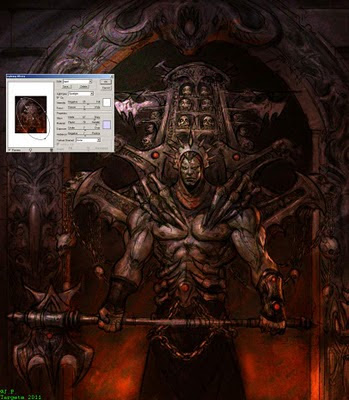
There are several ways to colorize your line work, one is using the variations function under the >image menu>adjust. Here you can see variations of your image and change the color to the overall image quickly by clicking the desired
color. I like to give my under-drawing a sepia or brownish warm color.
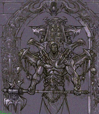
STEP 4
ADD A GROUND COLOR
As I mentioned before in step 2 your line work should be bold and clear because you will now use it as a top layer and lay a color ground underneath it in another layer. So create another layer
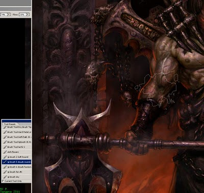
under your line drawing. Change the layer setting of your line drawing to multiply, go back to the layer underneath. Go to your RGB color slider and set it to this R 110, G 102, B 117. Take the paint bucket tool in the tools bar and click into the empty layer. The reason behind this is because
we are creating a color and value ground which we will add highlights and shadows to.
STEP 5
FILTERS ARE YOUR FREINDS
Many artist do not like using filters in their work which is fine but I like to use as many as I can. My favorite filter is the grain filter, found in the filters menu under texture>grain. By adding texture to your ground layer you will simulate real media, like paper or a grainy painting s
urface. Settings in the grain filter should be set to: grain type: clumped with an intensity of 39 and contrast of 50. The filter will add small colored grainy particles to your image, this will help it to look more like natural media.
STEP 6
THE MIGHTY DODGE TOOL
The Dodge tool gets a bad rap in photoshop, because many users tend to mis-use it making it obvious that the tool was used in the image. If used properly the dodge tool is a powerful tool.
In this step I
use the dodge tool to add highlights to my ground color. This is similar to adding white chalk on gray paper. The dodge tool does not erase or paintover the grain texture so the texture stays intact as I add highlights. This is backward painting because in art school we are taught to start with our darks and shadows first and finish up with highlights. I find the backward method easier for me when I put in basic highlights. It's important to know what direction your lighting will be emitting from and how many light sources there will be as you work.
ADDING DARKER VALUES
Now that I have my highlights I can now start to add shadows and some values to my ground color. I like to use the pre-made oil brush in photoshop, its not as smooth as the regular
round brush but not as hard as the pencil or hard brush. I set the brush setting to darken and apply dark colors like markers keeping areas some what translucent. I try to work very quickly in this step and really focus on shadows, values and form.
STEP 8
APPLY LIGHTING EFFECTS FILTER
The lighting effects filter under the filter menu>render is an exteremly usefull filter for painting in photoshop. It should be used to help establish quick broad lighting and color set up in your image. I've set up a creme colored spot light
for my main light source and two omni red/orange lights for my edge and background light source which will be flames. By previewing your image you can move the lighting around and see how it effects your image.
STEP 9
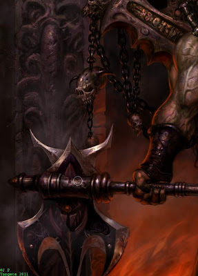
ESTABLISHING YOUR SURFACE MATERIALS
Before we continue with the painting it is important to establish the surface materials of the elements in the painting. If a viewer cannot distinguish flesh from stone or metal in your paintings, your image is getting further away from realism. Just like a 3d modeler who will create shaders f
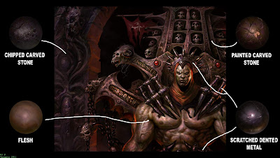
or their 3d renderings a 2d artist needs to establish a materials library in their heads or in a folder. For "The Purifier" there are four main surface materials:
chipped carved stone of the arch decor, the characters
flesh tone, the
painted carved stone of his back piece and the
scratched dented metal of the claws, head piece and weapon.
STEP 10
MERGE LAYERS START PAINTING
Once you know what materials go where you can now merge your drawing layer and ground layer and start painting on top of that layer or on a new layer. I choose to paint on a new layer in case I screw up. I roughly start to paint with my oils and soft brush with warm colors. Notice how some of the ground color is
showing through. This also makes the flesh tone closer to reality.
STEP 11
BLOCKING IN THE BACKGROUNDPainting more transparently in this step I roughly block in the background leaving bits of the ground color to show through a little. I paint in the flames very quickly, they will be refined later on. I've also started rendering the character's back piece keeping in mind the materials its made out of and how light will effect it. I also am
constantly aware of the lighting scheme as I paint making sure it is consistant as I work on the diffrent parts.
STEP 12
I LIKE PAINTING SKULLS
As I continue painting I get carried away with painting the skulls. There's nothing so raw and primordial then a skull of an animal or huma
n, it's that basic visual chunk of reality that seeps into Dark fantasy that makes it so appealing and scary to me
STEP 13
BACK TO THE BACKGROUND
Many times I will go back and forth from background to foreground and middle ground. In this step I work up the right arch decor and the flames a little more keeping in mind the material they b
oth are made of. I also have fleshed out the characters lower body. Notice the diffrence in materials from cloth to metal.
STEP 14
ARCH HEADPIECE
For the arch center head piece I wanted three degrees of light. Ambient lighting which shows the form, a dominent main light source and secondary under lighting emitting from the bottom flame. For the left side of the arch d
ecor I copied and flopped the right side and re-painted it with the proper lighting.
STEP 15
TEXTURING THE ARCH
Using a custom made texture brush I add small speckles to the arche's surface. This brush comes in ha
ndy in more ways then one.
STEP 16
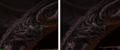
ADD SMOKE
On a seperate layer I paint smoke in the background with a custom cloud brush I created. This brush serves many purposes from clouds, smoke and fog.
 STEP 17
ERASING AREAS OF SMOKE
With the eraser tool I carefully erase the smoke areas where I want to show the foreground elemen
ts in the underneath layer.
STEP 18
UNSHARP MASK
After putting final touches I use the unsharp mask filter under filters menu>sharpen>unsharp to bring out some of the details of the painting. Always create a duplica
te layer of the layer you want to apply the filter to, because you can always erase the parts you don't want and keep what you have painted. This filter is great for tightening and sharpening your paint strokes. Just becareful not to over use it.
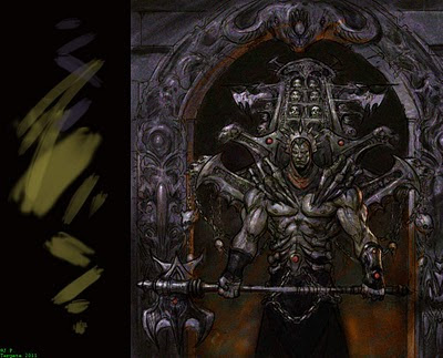
STEP 19
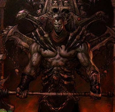
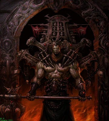
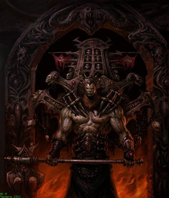
THE PROMISE LAND THE FINISHED IMAGE
After looking at the image I realized I painted it literally to dark and in consideration of it being a printed piece I needed to pump up the highlights in certain areas. I used both the level sliders under the im

age menu>adjustments>levels and my friend the dodge tool to bring out the highlights. So "The Purifier" is done but his reign of terror lives on.
For those interested you can purchase a print of the final image
here. just make sure you click on
photo prints to get diffrent sizes and prices.
I hope this tutorial was helpful. Feel free to leave suggestions or comments or share with your friends and fellow artist. I will be posting more insights and works in progress in the future.
J.P. Targete


